In the competitive landscape of eye care, a memorable brand identity is essential for standing out. The Eye Center of Southern Indiana is known for its excellence in eye medicine, but we wanted to change its visual identity to look and feel more modern. Inspired by the potential for an elevated brand presence, we set out to reimagine The Eye Center’s look, focusing on a comprehensive overhaul—from the logo and colors to social media ads and website design. Here’s how we envisioned a fresh, bold look for The Eye Center of Southern Indiana, one that captures their unwavering dedication to ocular health.
Reinventing the Logo: An Iconic Eye Symbol with Impact
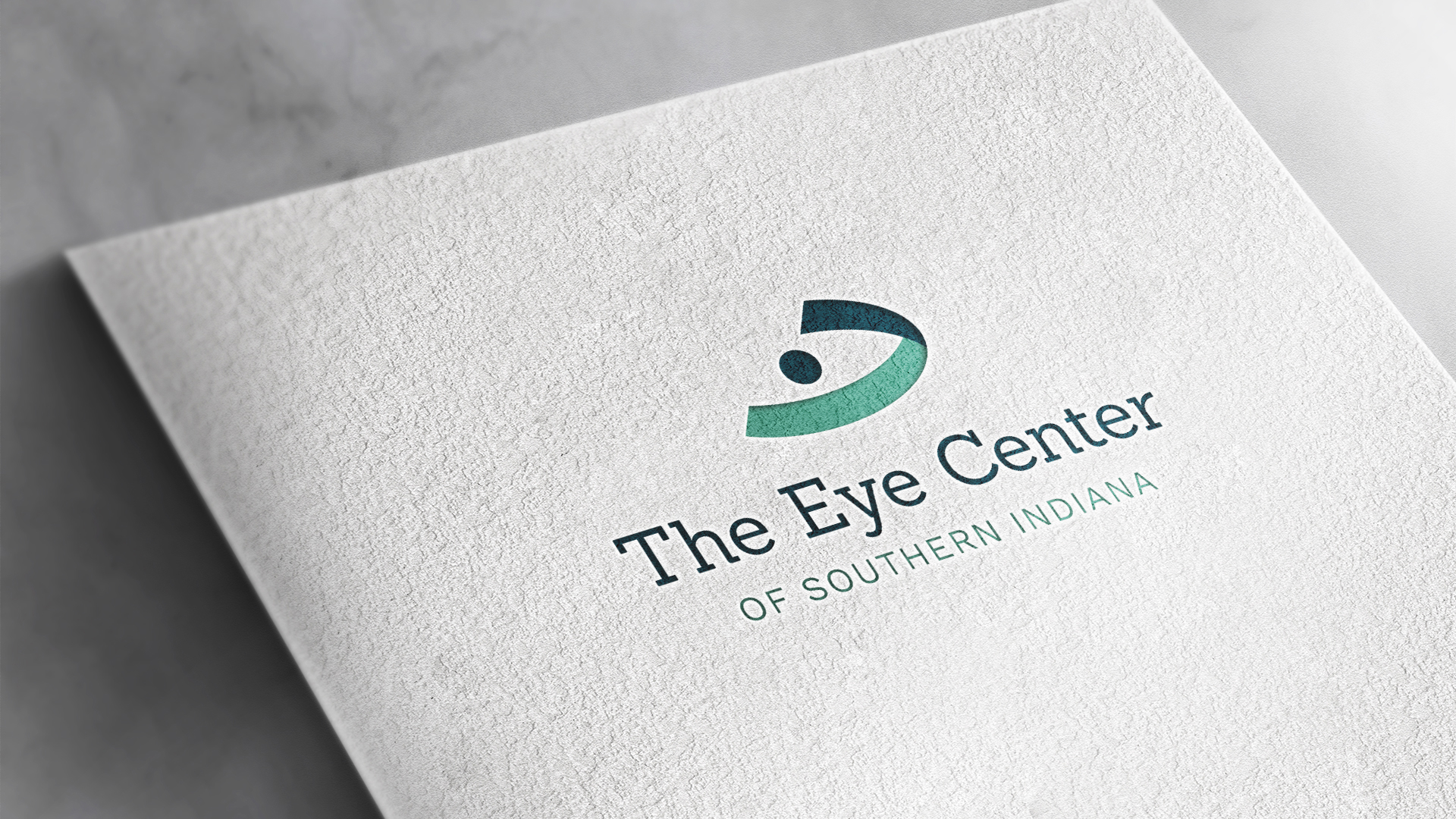
At the heart of this redesign is a striking new logo. We envisioned an eye-shaped symbol as the brand’s visual centerpiece. This powerful icon speaks directly to The Eye Center’s specialized expertise and commitment to patient care. With a clean, modern silhouette, the logo communicates precision and professionalism while making an immediate impression. For patients seeking top-tier eye care, this logo positions The Eye Center as a leader with a keen focus on ocular health.
A Modern Color Palette: Shifting from Blue to Vital Green
Why the Color Change Matters
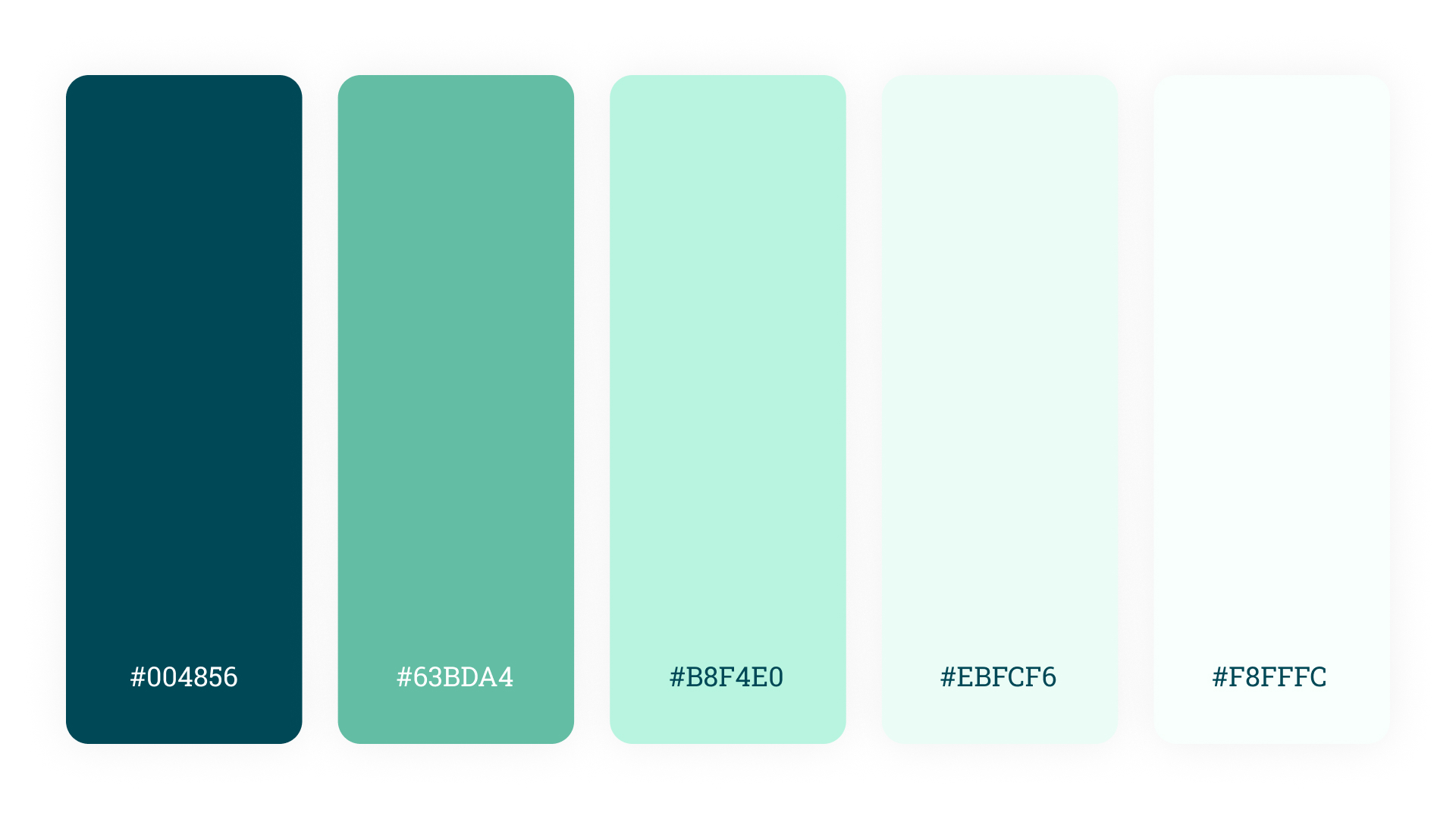
The Eye Center’s original palette—primarily navy and dark blue hues—conveyed trustworthiness, but the overall look felt traditional rather than innovative. For a brand focused on vitality and well-being, we felt that a fresh green palette would better embody a more modern brand. The new shades, ranging from vibrant greens to fresh whites, symbolize renewal, growth, and health—all vital associations for an eye care provider. This palette also enhances the brand’s visibility across digital and physical spaces, allowing for a distinctive, memorable presence.
The Palette Breakdown
Our chosen greens vary from deep, natural tones to lighter shades, complemented by clean whites. This range of green hues reflects health and clarity, echoing the vitality and energy that The Eye Center strives to bring to its patients.
Typography Reimagined: Clean, Modern Fonts for Readability and Impact
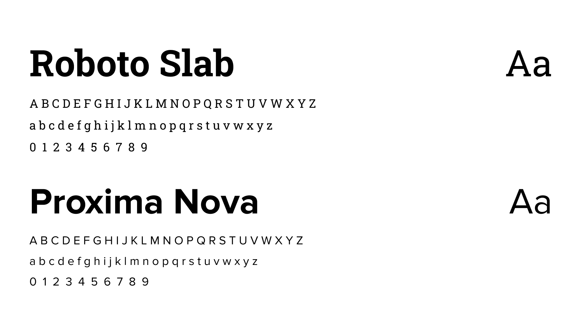
In addition to the color update, we implemented a fresh set of fonts that enhance readability while reflecting The Eye Center’s professionalism. We chose Roboto Slab for headline fonts and Proxima Nova for paragraph text. The new typography is clean, approachable, and modern, creating a cohesive feel across all brand touchpoints. Each font selection complements the brand’s new direction, balancing clarity with style to help guide patients through digital or printed materials effortlessly.
Social Media Ads: Custom Content that Engages
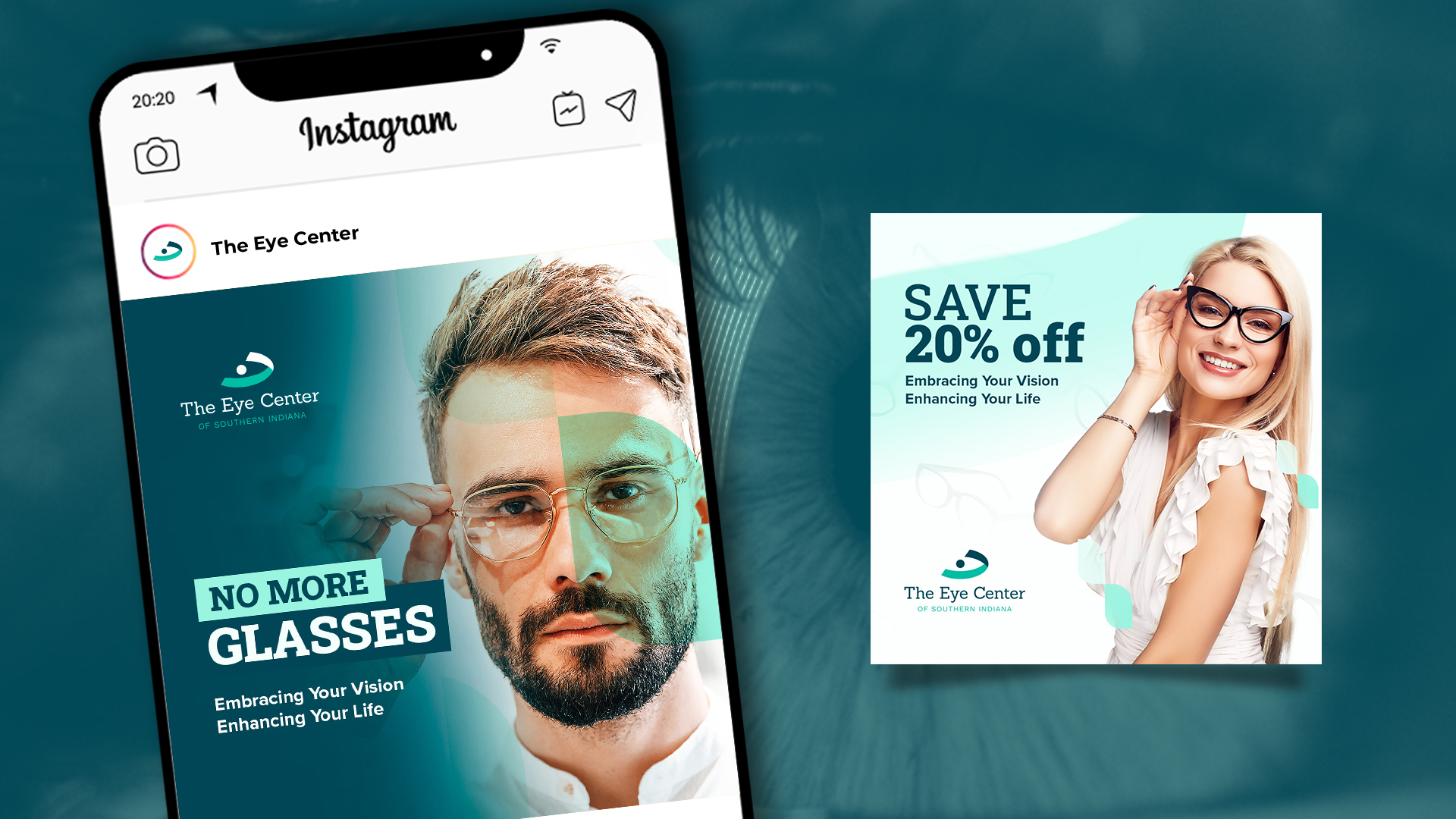
Today’s patients look online to evaluate their healthcare options, making social media presence vital for a brand like The Eye Center. We designed custom social media ads with a focus on the solution to a problem, promotional offers, and highlight the human element of The Eye Center with people in the ads. These ads stand out with their vivid green palette and iconic logo, ensuring they catch the eye while conveying the value and trustworthiness that The Eye Center offers. Each ad is crafted to provide information while building trust, positioning the brand as an authority in eye care.
Website Design Overhaul: Streamlined, Conversion-Focused, and Patient-Centric
Creating an Accessible Experience
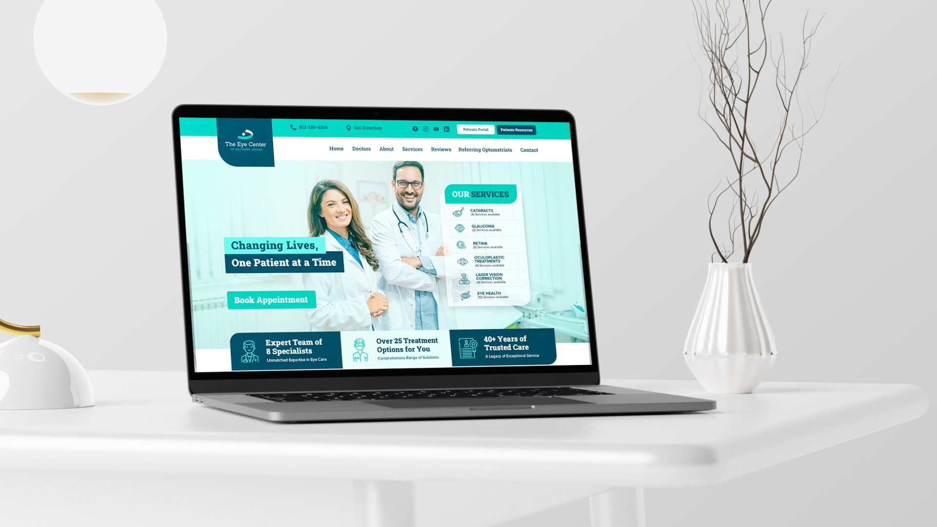
Our website redesign for The Eye Center was created with a patient-centric approach, making navigation intuitive and informative. Key calls to action are prominently placed, guiding visitors to essential services like appointment scheduling and treatment information. By integrating the new color scheme and logo throughout, we created a cohesive visual experience that aligns with the center’s commitment to care and professionalism.
Focused on Conversions
From intuitive buttons to strategically placed contact forms, every element of the redesigned website is crafted with conversions in mind. For potential patients, these seamless interactions reinforce trust, ease of access, and reliability—qualities that are vital in healthcare.
In Summary: A Brand Identity with Impact
Through thoughtful design choices, The Eye Center of Southern Indiana can communicate its dedication to ocular health in a way that feels fresh and modern. From a bold new logo to a vibrant green color palette, engaging social media ads, and a patient-centered website, every design decision works together to enhance the brand’s reach and impact. This reimagined identity allows The Eye Center to stand out in a crowded marketplace, offering patients a brand that reflects the cutting-edge care they can expect to receive.


