In today’s competitive landscape, a brand’s identity is often the first and most memorable impression. For companies like Clariti, leaders in laser vision correction, a modern and meaningful brand presence can enhance credibility and establish a deeper connection with clients. Inspired by Clariti’s expertise and commitment to cutting-edge vision correction solutions, we took a fresh look at their branding to explore how a bold rebrand could elevate their impact. Our goal was to breathe new life into Clariti’s visual identity, creating a cohesive, contemporary, and captivating brand presence that resonates with their audience. Here’s how we reimagined Clariti’s brand from the ground up.
Redefining Clariti’s Color Palette: Vibrant Tones for a Modern Feel
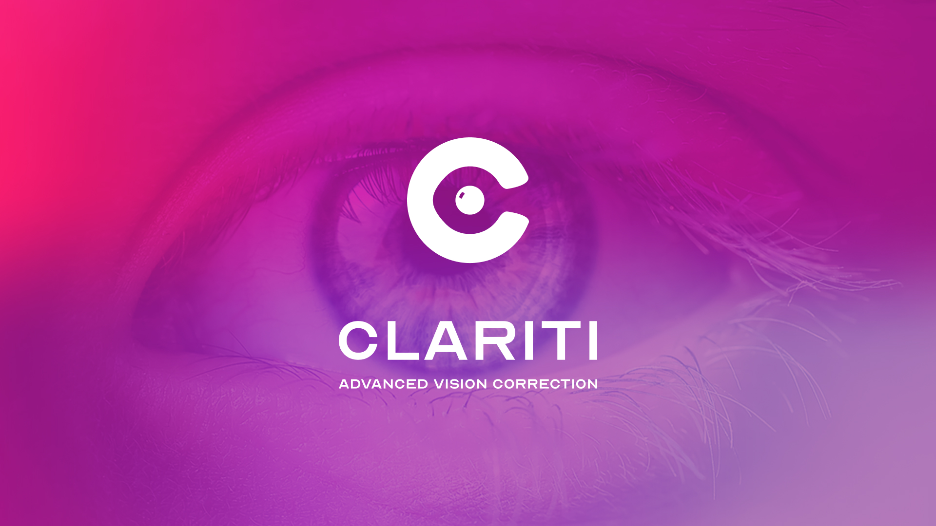
Clariti’s original color scheme, while professional, lacked the vibrancy to truly stand out in a field that thrives on innovation. To better reflect Clariti’s cutting-edge services, we designed a color palette that exudes modernity and energy. By introducing striking shades of bright pink, deep purple, rich dark blue, and eye-catching bright blue, we created a palette that immediately grabs attention and evokes a sense of clarity and rejuvenation. These colors work harmoniously across all brand assets, from web to print, ensuring consistency and boldness at every touchpoint.
Why Color Matters in Healthcare Branding
Color is powerful in establishing an emotional connection, especially in healthcare. For Clariti, a leader in vision correction, our vibrant colors aim to evoke a sense of renewal and positivity, capturing the transformative experience of improved vision. Every shade was carefully chosen to appeal to a forward-thinking audience seeking advanced vision solutions.

Crafting a New Logo: Eye-Inspired, Modern, and Memorable
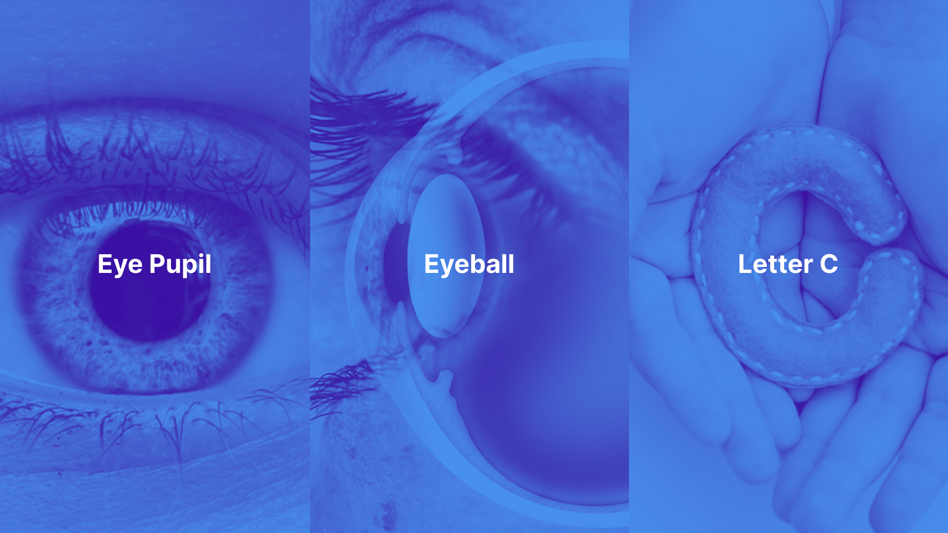
At the core of any rebrand is a logo that encapsulates the brand’s essence. Clariti’s new logo is both visually compelling and meaningful, drawing inspiration from the natural beauty of the eye. We incorporated elements such as the pupil, eyeball, and the letter “C,” arranging them within a clean, modern grid. This logo balances aesthetics with symbolism, subtly referencing Clariti’s focus on vision care. With smooth lines and balanced proportions, the design is versatile, recognizable, and perfectly suited for digital and print media alike.
The Font Choice: A Nod to Vision Testing
To enhance recognition, we chose a typography style inspired by the Snellen Chart, a universally recognized symbol of vision care. This font lends a sense of authenticity to the Clariti brand, subtly reinforcing the connection to vision improvement while maintaining a clean, modern look. The typographic choice bridges the gap between Clariti’s medical expertise and a more accessible, consumer-friendly aesthetic.
Custom Social Media Ads: Engaging, Informative, and On-Brand
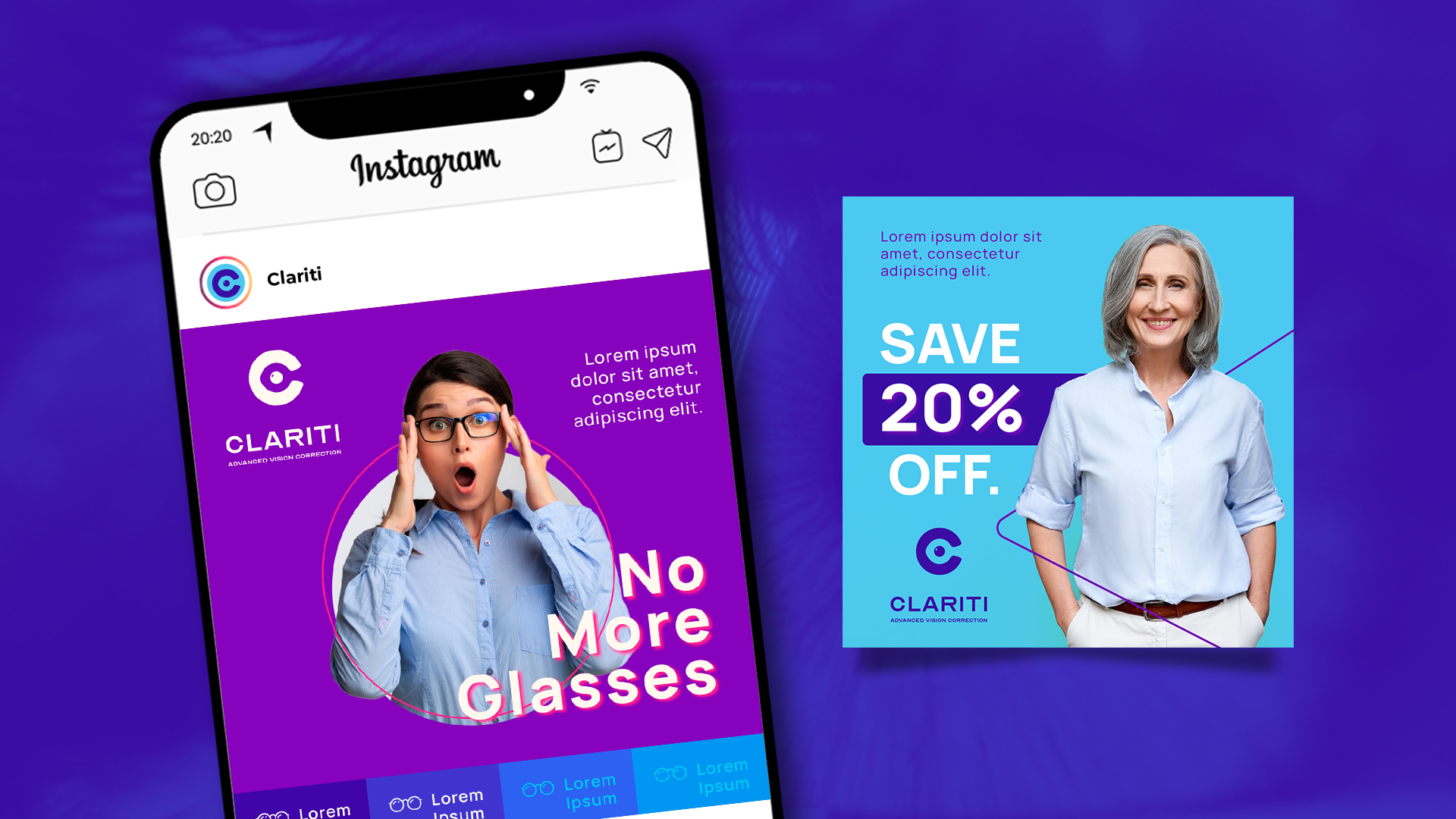
In today’s digital age, social media is a critical platform for brand engagement. Our custom social media ads for Clariti aim to capture attention instantly, with vibrant color splashes, dynamic designs, and concise messaging that highlights Clariti’s offerings. The ads are crafted to be both visually compelling and informative, drawing viewers in while delivering a clear message about Clariti’s vision correction services. Each ad was designed to blend seamlessly with the new brand aesthetic, creating a cohesive look across all social media platforms.
Keeping Ads Consistent Yet Fresh
We approached social media ads with a clear goal: consistency in branding without sacrificing creativity. By using the same color palette and typography as the rest of the brand, we ensured brand cohesiveness while delivering engaging, varied visuals that maintain user interest.
Conversion-Focused Website Design: Simplified for User Engagement
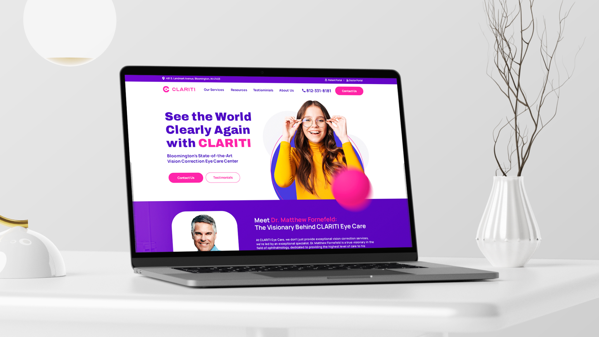
A rebrand is incomplete without an updated website that aligns with the new identity. Clariti’s redesigned website is clean, modern, and focused on conversions, with intuitive navigation and clearly defined calls to action. We designed the above-the-homepage above-the-fold with two color options: 1) pink & purple and 2) blue to show the impact a color change can have on the feel of a brand. Every section guides users toward valuable information about Clariti’s services, with seamless mobile and desktop functionality. The new design ensures that visitors are engaged from the moment they land on the site, with an optimal blend of visuals and content that reflects Clariti’s expertise in vision correction.
User Experience: Designed for Accessibility and Ease
Our design process prioritized user experience by creating a layout that’s easy to navigate, visually appealing, and informative. Clear calls to action, strategically placed throughout the site, encourage visitors to explore Clariti’s services and engage directly with the brand. This thoughtful design fosters a seamless journey from discovery to inquiry, reflecting Clariti’s dedication to patient care.
Additional Brand Collaterals: Business Cards and More
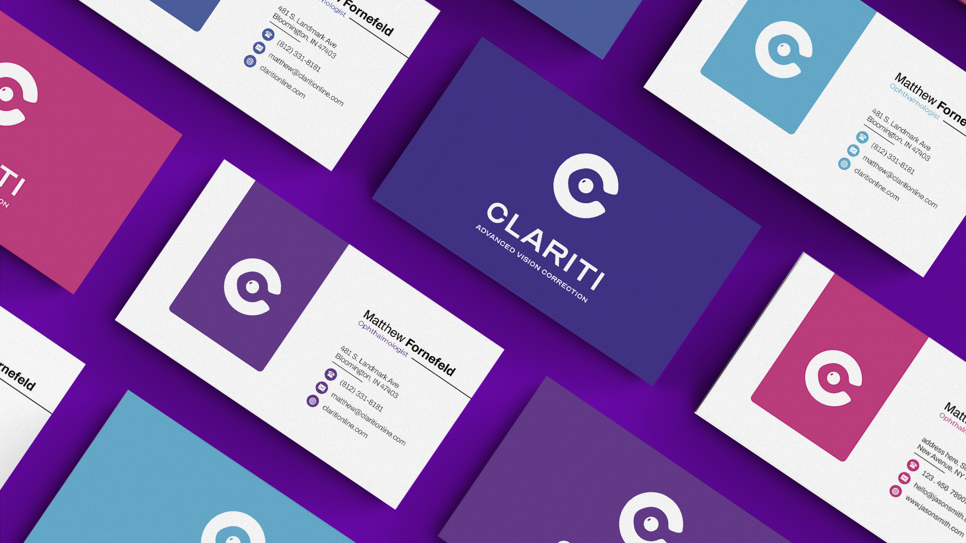
We extended the new brand design into essential collaterals like business cards, which now feature the vibrant new color palette and clean typography. Each card is a miniature reflection of Clariti’s identity, conveying professionalism and modernity in every interaction. This attention to detail reinforces brand recognition and establishes trust with both existing and potential clients.
Conclusion:
Our reimagined brand for Clariti is more than just a visual update; it’s a transformation that captures the essence of modern vision correction and the potential of a brighter future. With bold colors, a memorable logo, custom social media ads, and a conversion-focused website, Clariti is poised to make an even greater impact in the industry.
By redefining Clariti’s brand identity, we created a look and feel that is as advanced as the services they provide—setting them apart in the marketplace and inviting patients into a brand experience as clear as their vision solutions.
