HorseHeart Racing is a newly conceived brand dedicated to celebrating the majestic world of horse racing. As a venture initiated to attract investors, HorseHeart Racing embodies the passion, integrity, and spirit of this prestigious sport. The primary investor, a generous and devout Christian with a profound love for horses, sought to create a brand that resonates with both enthusiasts and stakeholders in the racing community.
Our mission was to showcase our comprehensive design capabilities by developing every aspect of the HorseHeart Racing brand from scratch. This included establishing a compelling visual identity that conveys the excitement and nobility of horse racing, while also ensuring a professional and cohesive brand presence across various applications.
By undertaking this project, our goal was to demonstrate our proficiency in brand development and our ability to create visually striking and functionally effective marketing materials that captivate and engage the target audience.
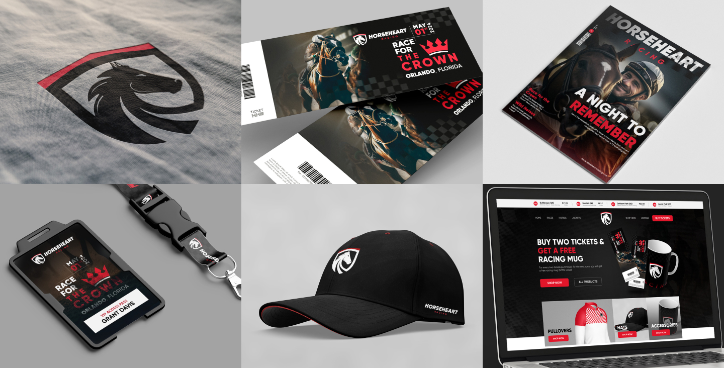
Complete Branding
Logo Inspiration:
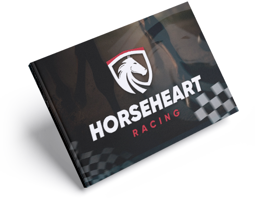
The HorseHeart Racing logo was inspired by a combination of images of a horse, a heart, and the iconic Ferrari logo. This fusion aimed to represent strength, speed, and passion.
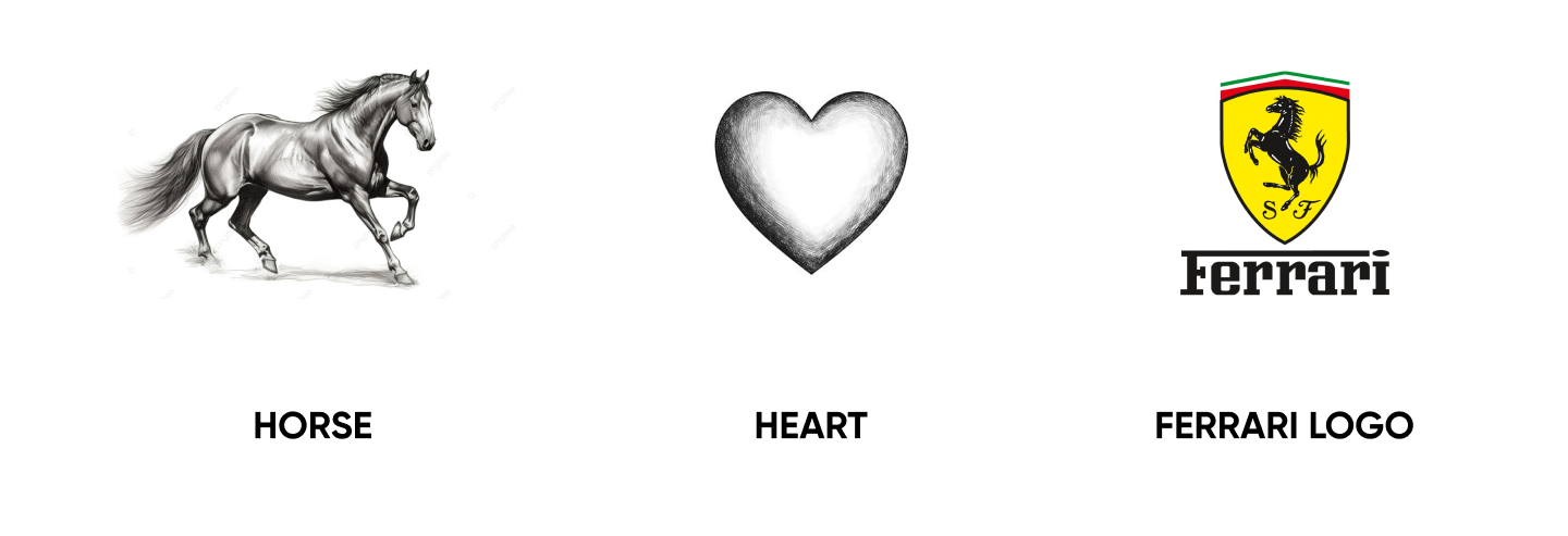
Symbol:
The symbol was designed in the shape of a shield, with a stylized horse head in the center, using black and red colors to convey a sense of protection and dynamism.

Typography:
We used a bold italic font to emphasize the idea of strength and speed, essential characteristics in the world of racing.

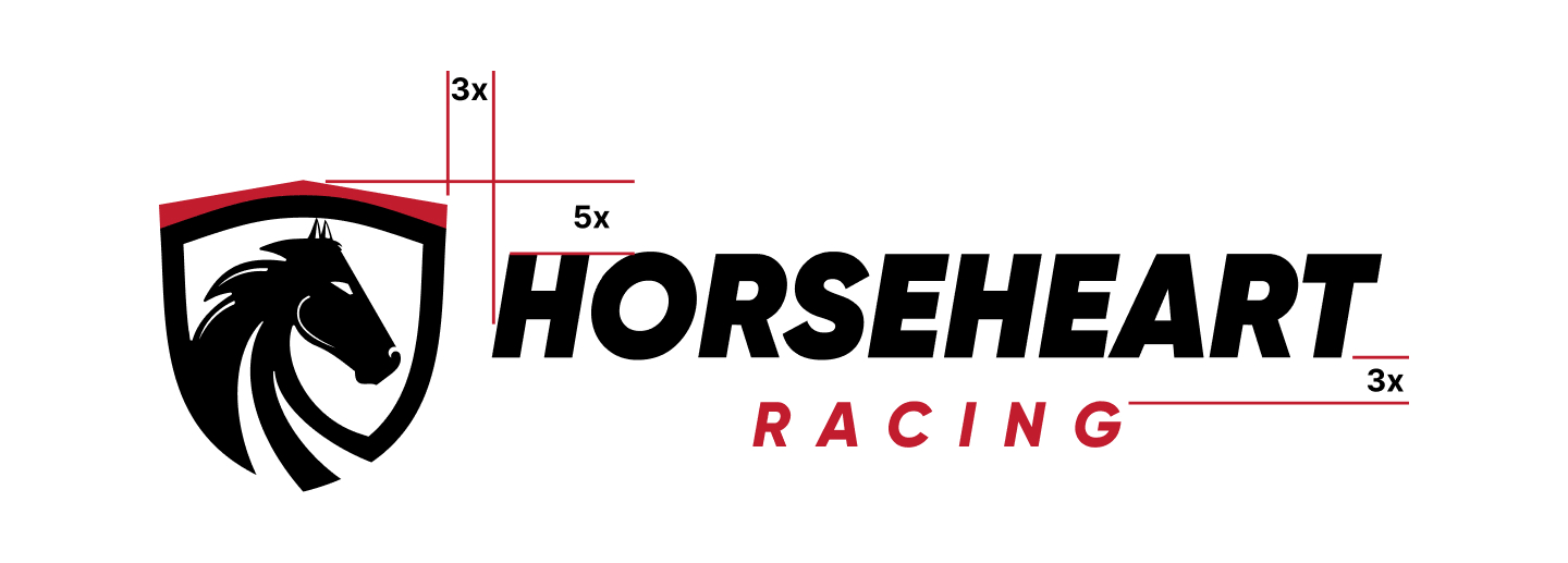
Positioning and Alignment:
The logo features precise positioning among its elements, ensuring a harmonious and impactful design.
Font Family:
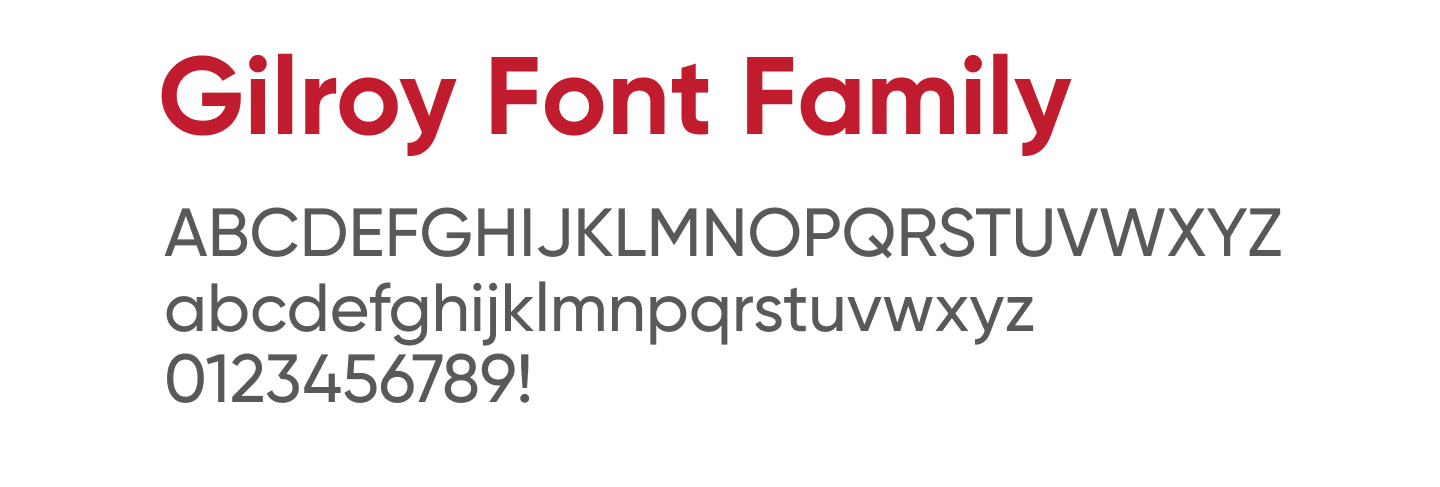
For typography, we selected the Gilroy Font Family, known for its modernity and legibility, perfectly complementing HorseHeart Racing’s visual identity.
Color Palette:
The primary color palette includes three tones:
- Heart Red (#C11C2E): A vibrant red symbolizing passion and energy.
- Pure Black (#000000): A deep black representing strength and elegance.
- Pure White (#FFFFFF): Pure white for balance and clarity.
Other shades include light gray, medium gray, and a burgundy red, providing versatility in the brand’s application.

Stationery Application
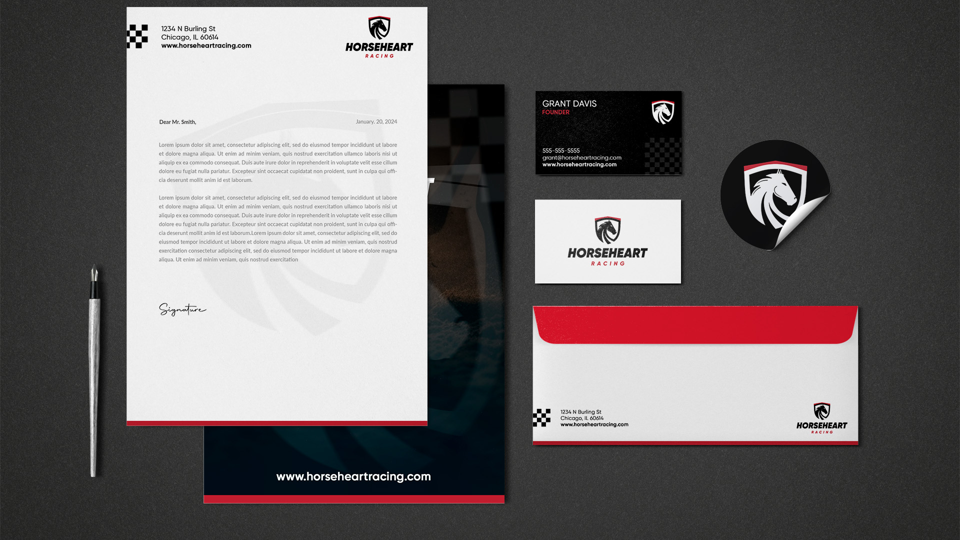
The application of a logo on stationery is a vital component of effective branding. For HorseHeart Racing, we ensured that the brand’s visual identity was seamlessly integrated into various office materials to create a cohesive and professional image. The stationery suite includes letterheads, business cards, ID badges, envelopes, and other office supplies, all designed to reflect the brand’s core values of strength, speed, and elegance.
Using consistent branding across all stationery items helps establish a strong brand presence and reinforces brand recognition. It provides a unified look that enhances the credibility
Product Branding
To further enhance HorseHeart Racing’s brand presence and generate additional revenue streams, we developed a comprehensive product branding strategy. Understanding the passion and enthusiasm of horse racing fans, we designed a range of branded merchandise intended for sale at official events and online stores.
Our product branding included:
- Apparel: We created stylish and functional clothing items such as caps, t-shirts, polos, and jackets. Each piece was designed to reflect the brand’s core values of speed, strength, and elegance, using the bold and iconic HorseHeart logo.
- Accessories: We extended the branding to include everyday items like mugs and other accessories that fans can use, keeping the brand in their daily lives.
- Event Merchandise: For the “Race for the Crown” event, we developed specific merchandise such as custom t-shirts and promotional materials to enhance fan engagement and provide memorable keepsakes.
By offering a diverse range of branded products, we aimed to boost HorseHeart Racing’s visibility and create new opportunities for fans to connect with the brand, thereby increasing both revenue and brand loyalty.
This approach not only showcases our design capabilities but also demonstrates our strategic thinking in creating tangible products that enhance brand recognition and provide additional income for the business.

Event Branding
Promotional Materials:
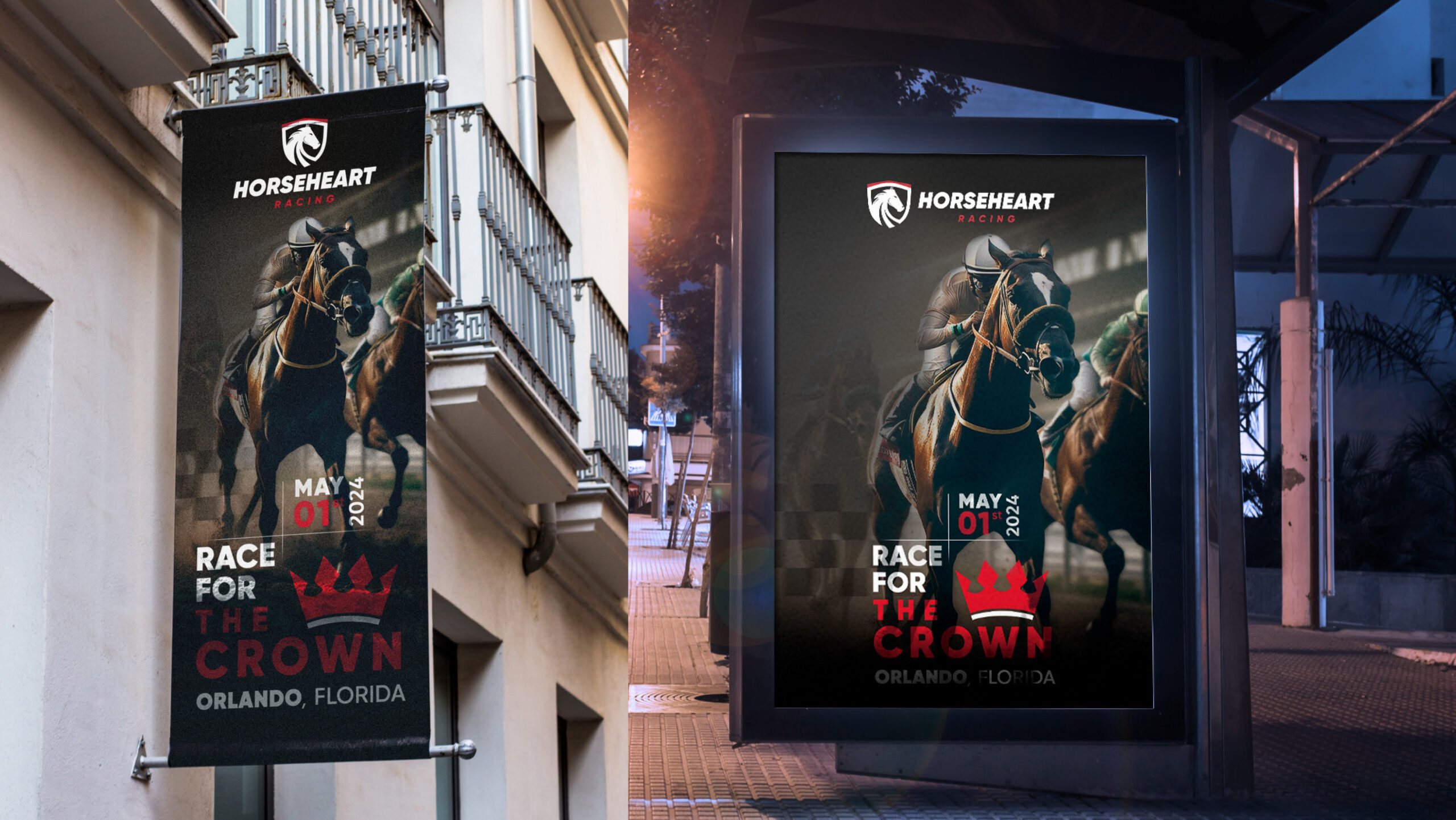
For the “Race for the Crown” event, we developed striking promotional materials to create anticipation and awareness. This included high-impact posters and banners strategically placed in prominent locations. The designs featured dynamic imagery of horse racing, the HorseHeart Racing logo, and event details, ensuring they captured attention and conveyed the excitement of the upcoming event. These promotional pieces were crucial in generating buzz and drawing in the audience, showcasing our ability to create visually compelling marketing materials.
Event Day Materials:
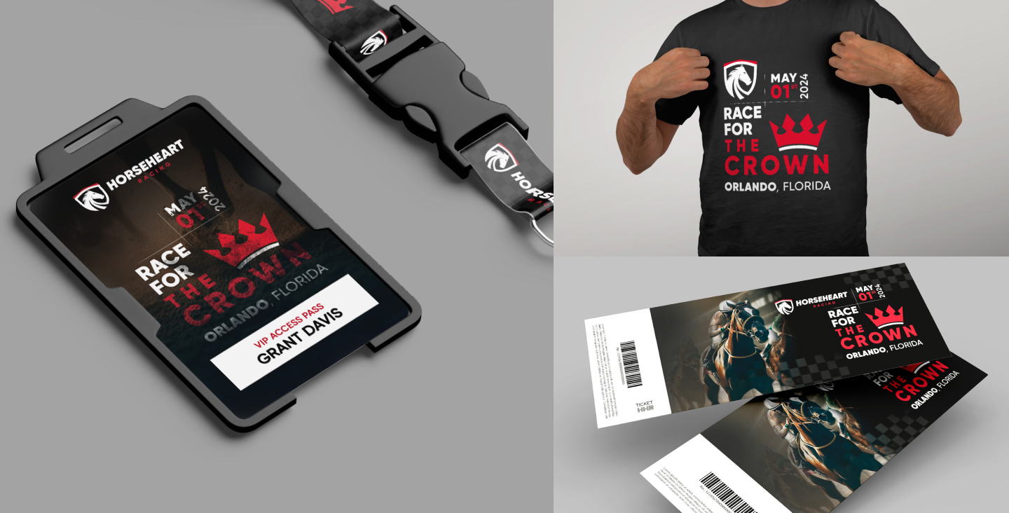
To enhance the event experience and maintain a consistent brand presence, we created a range of materials for use during the event. This included VIP access passes and lanyards, event tickets, and branded t-shirts for staff and attendees. Each item was meticulously designed to reflect the HorseHeart Racing brand, providing a cohesive look and feel throughout the event. The use of branded merchandise and materials not only heightened the professional atmosphere but also fostered a sense of unity and excitement among participants and spectators.
By taking a 360º approach to event branding, we demonstrated how DIGITAL& goes beyond brand creation to develop comprehensive strategies that ensure the success and visibility of our clients’ events.
Digital and Print Marketing
To ensure HorseHeart Racing’s brand reached a broad audience and engaged effectively with potential customers, we implemented a comprehensive digital and print marketing strategy. This approach combined the best of both worlds, leveraging the extensive reach of digital platforms with the tangible impact of print materials.
Digital Marketing:
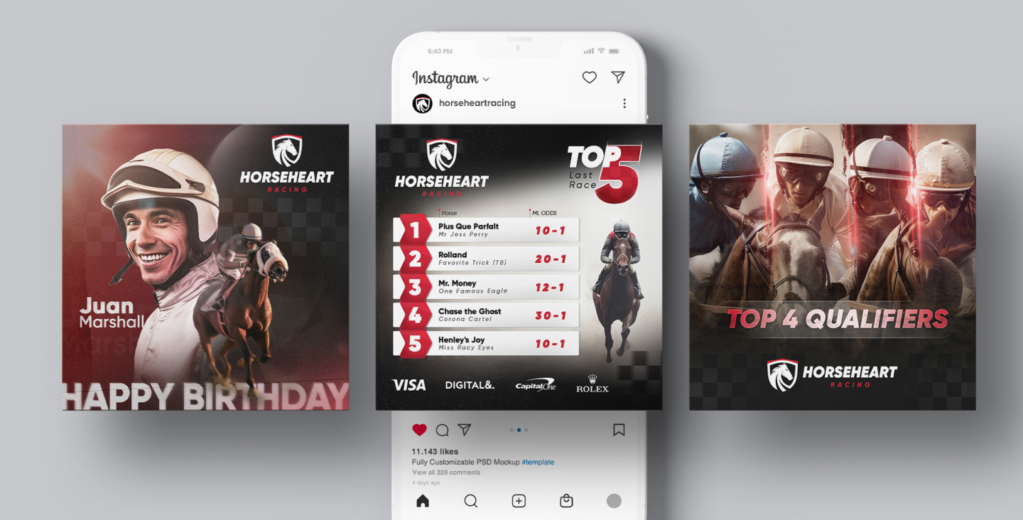
We created a series of engaging social media posts tailored for platforms such as Facebook, Instagram, and Twitter. These posts were designed to capture the dynamic spirit of HorseHeart Racing and its events, using striking visuals, compelling copy, and strategic hashtags to boost visibility and engagement. Additionally, we developed digital advertisements and banners for online use, ensuring the brand’s presence was consistent and far-reaching. Our digital marketing efforts aimed to build a strong online community around HorseHeart Racing, drive traffic to their website, and ultimately increase event attendance and merchandise sales.
Print Marketing:
Complementing our digital efforts, we designed a range of print materials to further enhance brand recognition and reach offline audiences. This included magazine advertisements, brochures, and flyers distributed at strategic locations. The print materials maintained the brand’s visual identity, featuring high-quality images and clear, persuasive messaging to attract attention and convey the essence of HorseHeart Racing. By integrating print marketing into our overall strategy, we ensured that the brand had a presence in physical spaces, reaching potential customers who may not be as active online.

Through a balanced mix of digital and print marketing, we demonstrated how DIGITAL& creates multi-faceted campaigns that effectively promote brands and engage diverse audiences across various channels.
Website Layout
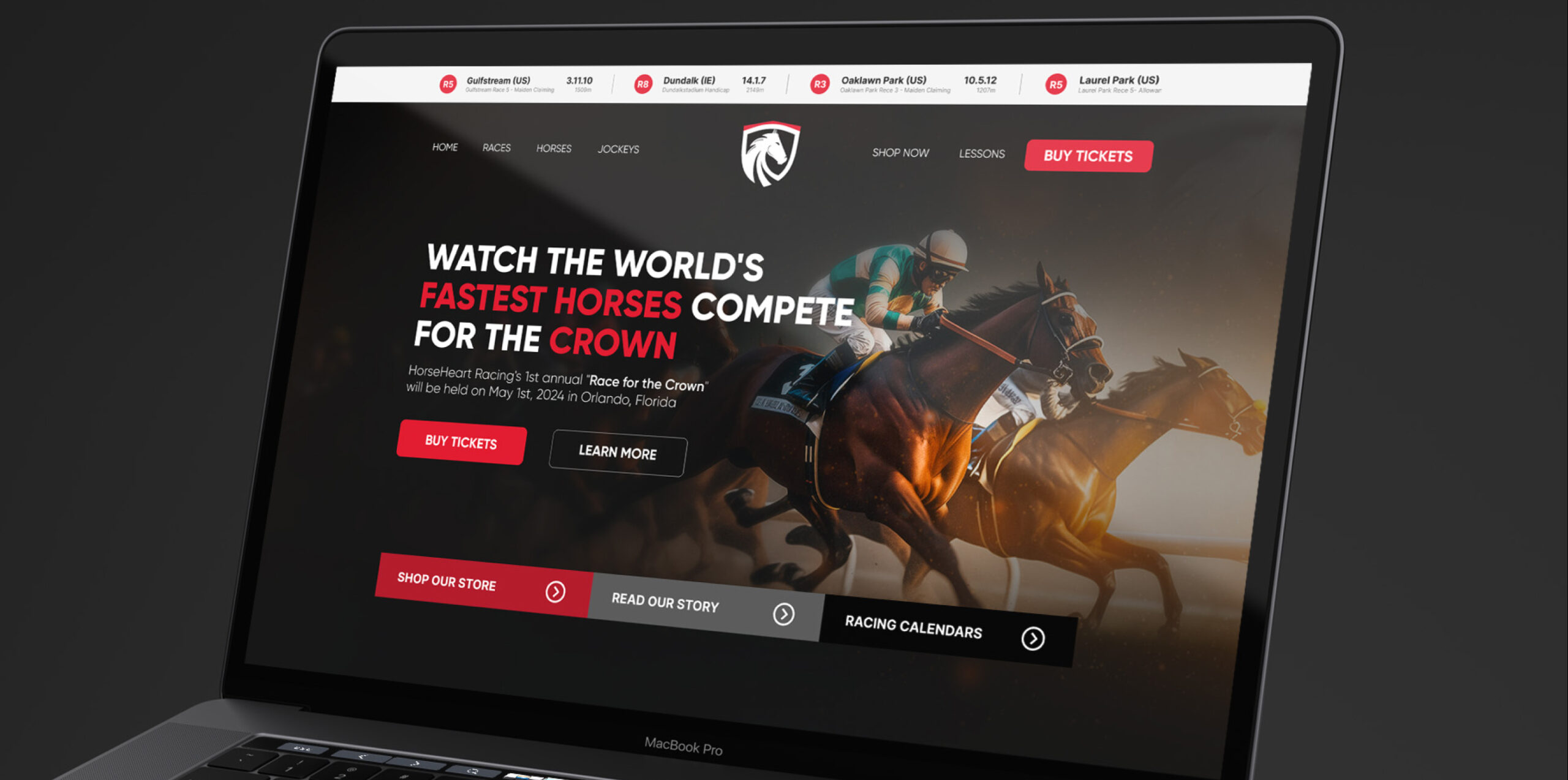
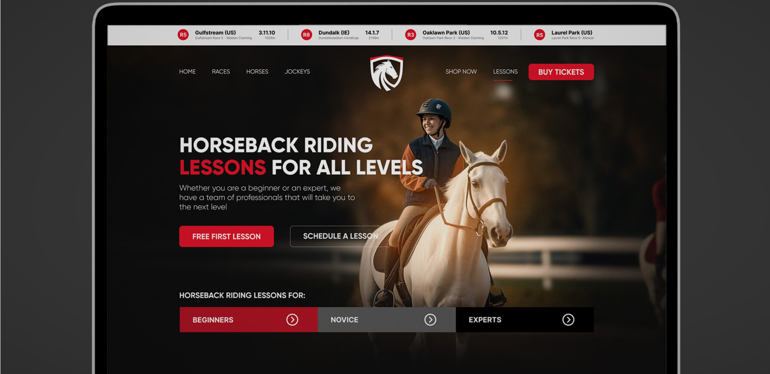
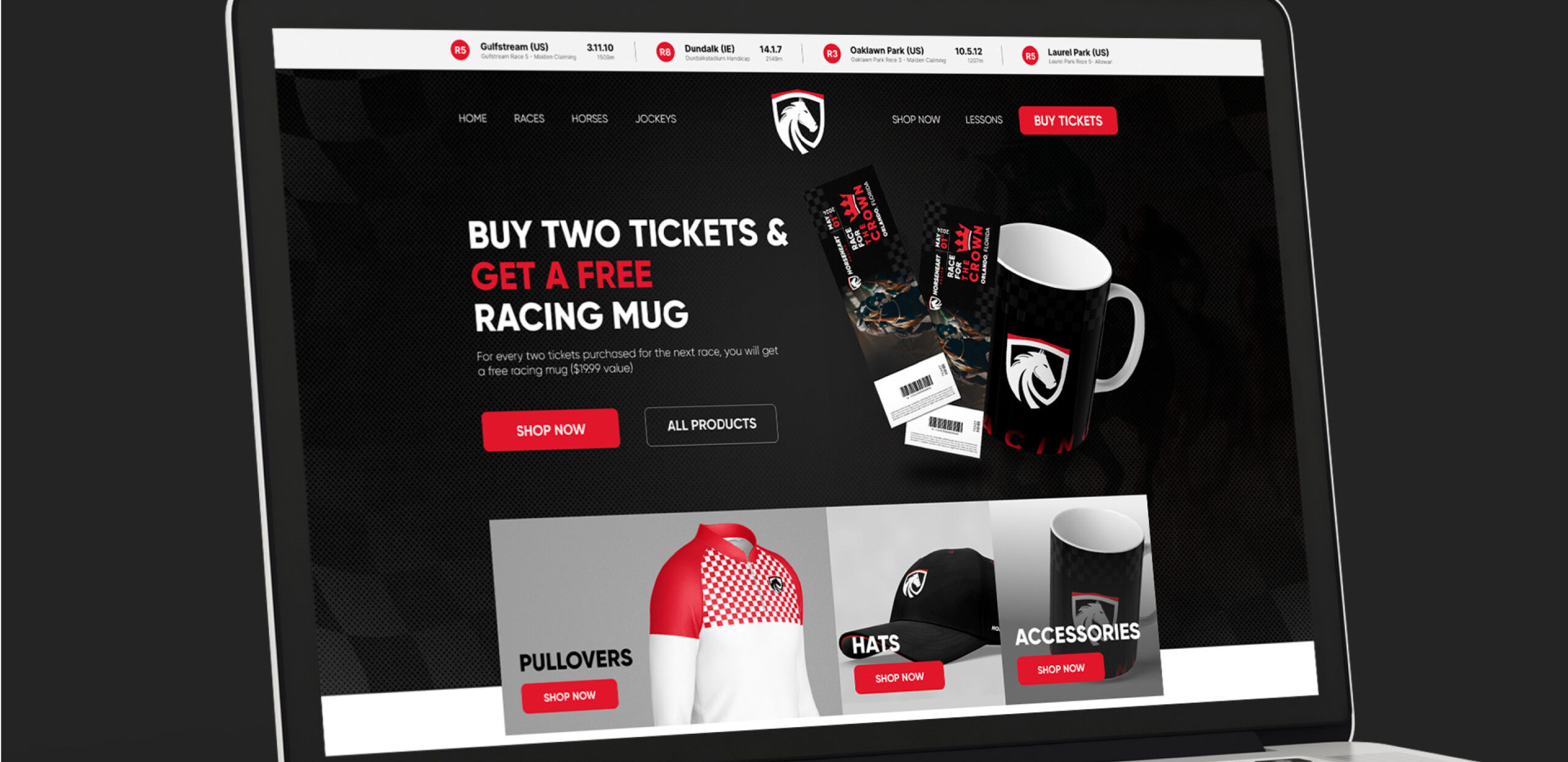
To showcase the versatility and comprehensive nature of HorseHeart Racing’s online presence, we developed three distinct website design layouts, each tailored to different aspects of the brand’s offerings. These layouts were designed to provide an engaging user experience, drive traffic, and convert visitors into customers or participants.
Homepage:
The homepage layout focuses on the core of HorseHeart Racing – the thrilling world of horse racing. Featuring dynamic visuals of races, key event information, and easy navigation, the homepage aims to captivate visitors and convey the excitement of the sport. The design includes prominent call-to-action buttons for buying tickets and learning more about upcoming events, ensuring visitors can easily access the information they need.
Lessons Page:
Recognizing the importance of fostering a community around equestrian sports, we designed a dedicated lessons page. This layout highlights the horseback riding lessons available for all skill levels, from beginners to experts. The page includes detailed information about the lessons, profiles of the instructors, and testimonials from previous participants. With clear options to schedule a lesson or sign up for a free first lesson, the design encourages visitors to engage with the brand and take the next step in their equestrian journey.
E-commerce Page:
To support HorseHeart Racing’s merchandise sales, we developed an e-commerce page layout. This design features a clean and intuitive interface where visitors can browse and purchase branded products such as apparel, accessories, and event memorabilia. The layout includes product categories, detailed product descriptions, and high-quality images, ensuring a seamless shopping experience. Special promotions, such as discounts or bundled offers, are highlighted to boost sales and enhance customer satisfaction.
These website layouts demonstrate DIGITAL&‘s ability to create user-centric designs that not only reflect the brand’s identity but also drive engagement and conversions. By addressing various aspects of HorseHeart Racing’s offerings, we ensured a cohesive and compelling online presence that supports the brand’s growth and success.
Conclusion
The HorseHeart Racing project showcases the comprehensive capabilities of DIGITAL& in brand development and marketing strategy. From creating a strong visual identity and applying it across various platforms to developing detailed event and product branding, we demonstrated our ability to think holistically and strategically. Our efforts in digital and print marketing further solidified the brand’s presence, while the website layouts provided an engaging and user-friendly online experience. Through this project, we illustrated how DIGITAL& can effectively elevate a brand, ensuring its success and visibility in a competitive market.
